
Front end Developer
Images on websites can be a huge pain when you are optimizing a site. We want our images to render as crisp as possible but we also want our sites to load as fast as possible. Content creators will often ask "what size image should I upload" and with the thought of some tiny image being rendered at full-screen width pixelated out of control we'll answer "as large as you've got". The content creator will then upload a 2mb jpeg and the load time/network request size will increase dramatically.
Responsive images can be a decent solution for this. A front end developer can achieve this in many ways. A popular way would be to use a <picture> element with the contents of multiple <source>'s using srcset and `media` attributes and a default <img> tag.
I'll explain how we can do that in Drupal 8.
The scenario I'm trying to set up in this example is a paragraph that references a media entity with an image field.
This module may already be installed on your project so just head to Admin > Config and ensure that the Responsive image styles module is enabled.
The default theme will already have a breakpoints YAML file. If you're using a custom theme you'll need to make sure you have a breakpoints YAML file for it. This should exist at themes/{theme-name}/{theme-name}.breakpoints.yml, where {theme-name}, is the name of your theme.
Create or open the file and configure your breakpoints. There should be a few breakpoints in there and they'll look something like this
custom_theme.small:

  label: small

  mediaQuery: "(min-width: 0px)"

  weight: 1

  multipliers:

    - 1x

    - 2x

custom_theme.medium:

  label: medium

  mediaQuery: "(min-width: 768px)"

  weight: 2

  multipliers:

    - 1x

    - 2x

custom_theme.large:

  label: large

  mediaQuery: "(min-width: 1024px)"

  weight: 3

  multipliers:

    - 1x

    - 2x
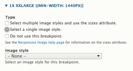
You can add as many breakpoints as you need to suit your requirements. The weight should go from 0 for the smallest breakpoint to the highest number for the largest breakpoint. The multipliers are used to provide crisper images for HD and retina displays.
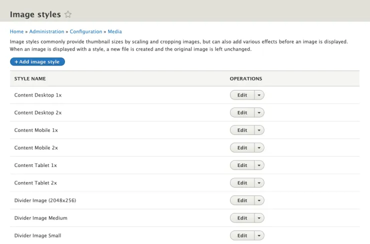
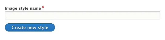
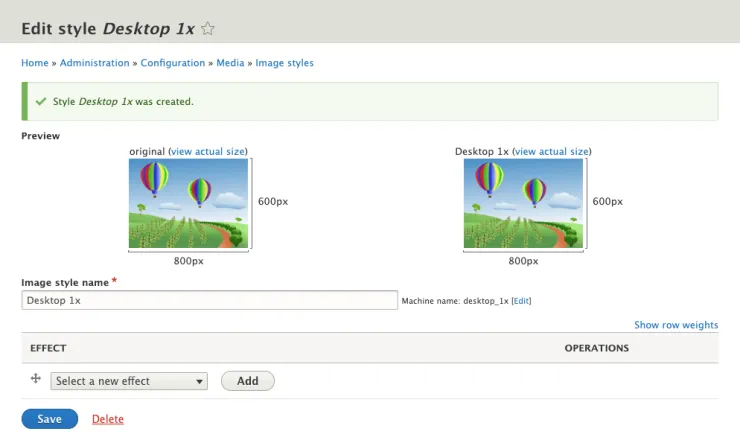
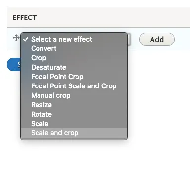
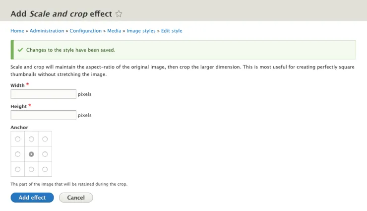
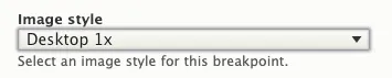
Head to Admin > Config > Media > Image Styles and create a size for each breakpoint.
When you have created all the sizes for your responsive format you can move on to the next step.
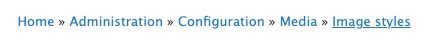
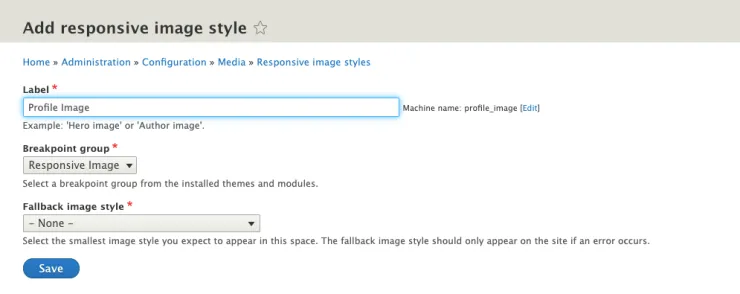
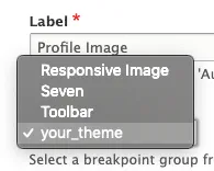
Head to Admin > Config > Media > Responsive Image Styles

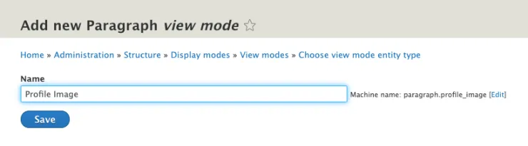
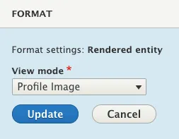
Head to Admin > Structure > Display Modes > View Modes, click 'Add new view mode' and add your display mode. In this instance, we'll use 'Profile image' again.
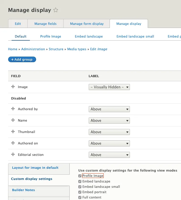
Head to Admin > Structure > Media Types > Image > Manage display

Go to Structure > Paragraph Types > {type} > Manage Display
At this point you should be all set.
<picture>
  <source srcset="/sites/default/files/styles/profile_image/public/2019-11/image.jpeg 1x" media="(min-width: 1024px)" type="image/jpeg">
  <source srcset="/sites/default/files/styles/profile_image_1024x1024_/public/2019-11/image.jpeg 1x" media="(min-width: 768px)" type="image/jpeg">
  <source srcset="/sites/default/files/styles/profile_image_512x512_/public/2019-11/image.jpeg 1x" media="(min-width: 320px)" type="image/jpeg">
  <img src="/sites/default/files/styles/profile_image_256x256/public/2019-11/image.jpeg" alt="A profile Image" typeof="foaf:Image">
</picture>