Decouple Design with Styleguide Driven Drupal Development
The traditional approach of directly styling default Drupal markup is not a scalable solution when we consider the volatility of the modern browser ecosystem. It is now necessary for front-end developers to abstract design patterns into manageable components. By using a styleguide we can automate the process of isolating and cataloguing patterns so they can be iterated and tested against independently. In this post I discuss ideas and put forward some informal rules around managing these components from within a styleguide.
Identifying and isolating design patterns
Identifying design patterns is difficult in Drupal because sitebuilding is so heavily tied to the front-end. When we are pointing and clicking in the admin interface, it is easy to try and shoehorn design into Drupal's opinionated sitebuilding components like blocks, panes, views, nodes and smaller components like fields which all have different markup defaults. After all, it is easier to let Drupal generate our markup than write it ourselves. Deviating from these markup defaults however is difficult and involves using Drupal's theming system, which uses a combination of template files, theme functions, preprocess functions, and database configuration to store customizations.
Freeing our design patterns from the constraints of Drupal's sitebuilding implementation allows us to focus on them. Why might we want to focus on them? Because design is fragile on the modern web. Devices, accessibility, interaction, and performance are variables that come to mind.
Take this simple "read more" link. It looks straightforward, but the component is most certainly not.

Below is a list of things the component is concerned with (I will spare you the 30 lines of CSS):
- There are hover, active, and focus states on the link.
- There is an inline or imported SVG that needs to inherit hover color states.
- There are special typography rules for responsive versions of the link.
- There are different extended variations of the component placing the arrow to the left or right.
If we can prune a design component to use the simplest markup and package the CSS into re-usable patterns, the conditions above becomes much easier to reason about.
// Example of Drupal markup
<div class="field field-name-field-pbundle-destination field-type-link-field field-label-hidden">
  <div class="field-items">
    <div class="field-item even">
      <a href="#">Read more</a>
     </div>
  </div>
</div>
// Simplified markup
<a href="#" class="read-more">Read more</a>
The many lines of CSS are encapsulated in several re-usable patterns that are also extended in other components.
.read-more,
%read-more {
   @extend %font__medium;
  @extend %underline-on-hover;
  @extend %link__border--thick;
  @extend %link-arrow--after;
padding-top: 1rem;
display: inline-block;
}
Using JohnAlbin's fugly selector method, we could then @extend the abstracted pattern onto a Drupal selector, or a template file to change field.tpl.php
.field-type-link-field {
  @extend %read-more;
}
How does Styleguide Driven Development help?
Having a styleguide as the first stage in prototyping, designing, testing, and maintaining your UI components in your development process can infer the buzzword “Styleguide Driven Development” (SDD).
SDD allows us to set UI standards and patterns so that similar implementations are followed down the course of the development cycle. Using a styleguide ensures that there is a single source of truth for the UI on our site. This not only gives us something to test against but also serves as a user manual for other team members assembling the Drupal front-end.
When display patterns are segregated, catalogued and understood by the team they can be easily applied via templates or display config using Drupal sitebuilding. Someone who is a strict backend developer can participate in getting markup into Drupal without needing to write any CSS by just applying classes inside cTools exports and templates. In some cases, those with no development experience at all can configure Drupal in the admin interface to output the classes and markup it takes to create a particular component exemplified in the styleguide.
Another benefit of SDD is narrowing the conversation. We are used to talking about the theme as one monolithic thing. We spend a lot of time talking about things like the base theme, or if we do break down the conversation it is broken down to the look of specific pages. When you have a documented styleguide, narrowed conversations can be had about smaller pieces of UI. This can happen because these pieces are catalogued and referenceable.
How does the SDD process work exactly?
We need a blank canvas in order to isolate design patterns and mould the markup and styles into responsive, performant, accessible and pretty nuggets of UI that we can assemble in Drupal. A styleguide is this blank canvas, it uses your website’s live CSS, Javascript and example markup to enumerate components into a table of contents that are easy to find.
The software we use at PreviousNext to create our styleguide is KSS-node, an offshoot of Knyle Style Sheets used by Github but rewritten in Node.js. JohnAlbin, my co-worker and creator of Drupal’s most popular base theme, Zen, is the maintainer of KSS-node. So it makes sense we dogfood it on our projects.
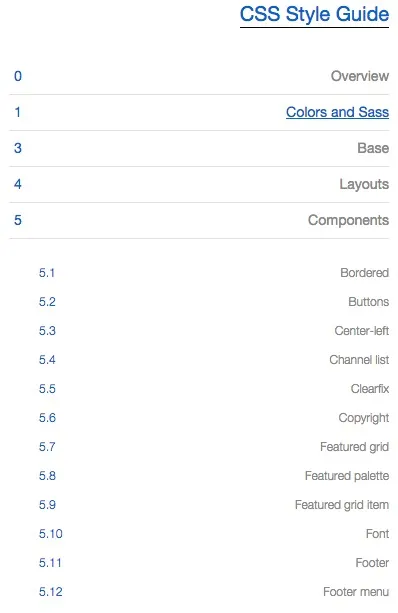
This is what a portion of the table of contents of one of our styleguides looks like:
The markup for your styleguide lives in our preprocessed SASS files along with documentation describing those components. When you compile your markup, a styleguide is magically rebuilt using server-side Javascript via Node.js.
_button.scss
// Button
//
// Markup: button.html
//
// Styleguide 3.1

.button,
%button {
  @include links-no-decoration__link;
  font-weight: normal;
  margin: 1rem 0;
  color: inherit;
  display: block;
  text-transform: uppercase;
  text-align: center;
  border: solid 1px;
  border-color: inherit;
  padding: .75rem 1rem;
  &:hover {
    color: #fff;
    background: $palette-1;
    text-decoration: none !important;
  }
}
button.html
<a class="button" href="#">Test Button</a>
KSS-node is built on top of Yehuda Katz’ Handlebars which is a templating technology that can be used both in the browser and on the Javascript server. KSS-node uses Handlebars to scaffold out components into a catalogue that is enumerated and linked.
A recent addition to KSS-node is the ability to reference separate .html files where your example markup lives. This happens by leveraging Handlebars partials. The ability to reuse components allows you to build mashups of multiple components and exemplify in your styleguide components working together. Prototyping in static HTML is much faster than building things out in Drupal for front-end developers and designers versed in HTML/CSS.
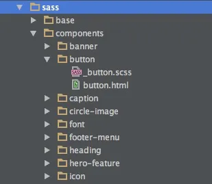
..sites/all/themes/custom/my_theme/sass folder structure
The eventual progression of this workflow is to have your application use the actual markup your styleguide uses. When changes are implemented in your styleguide, they then flow to your application. This is not straightforward when your CMS is using PHP to template your data. This may be easier in Drupal 8 when we have twig.
We are still in the midst of developing a process that proficiently uses the styleguide to improve our Drupal development process, I have put together a few informal rules we are trying to follow.
Some informal rules around our SDD process
1. Name your classes/components based on the display patterns they represent
Try to avoid naming classes based on the section, page, or content you are theming.
// This class can't be re-used
.homepage-sidebar-related-blog-title-list {}

// Drupal classes can't be re-used
.block-blog-titles {}

// Class that only describes display is easily extended or re-used
.list-arrows {}
2. Provide the same namespace for your partials and classes.
_button.scss
.button {...}
.button--large {...}
3. Separate the styling of base elements from the styling of customized display patterns.
Styling of base elements is often hard to encapsulate. If you must style a base element, try extending a custom class.
These examples come to mind:
blockquote { @extend %block-quote; }

h2 { @extend %heading--2; }
4. Store example markup and/or templates in the same folder or file as the the CSS that styles them.
Because of the close relationship between markup and styles, the markup actually serves to document your styles, which provides understanding and maintainability to those editing or re-using your display patterns in the future.
5. Build the component in raw HTML/CSS in the styleguide first, before any markup is generated by Drupal.
Prototyping in HTML/CSS should happen before any sitebuilding in Drupal takes place, but this prototyping should happen on a component by component level. The “entire site” should not be prototyped. Sitebuilding should happen in the same sprint and preferably as close to tandemly as possible to the prototyping of the UI.
Since most content in Drupal is heavily tied its display, it is important that we know and discuss the responsive, performance, and design constraints around our component before Drupal becomes intertwined with development. When we understand the markup of a component, better and more complete sitebuilding tasks can be done in Drupal. This does not mean we build the entire styleguide in the first sprint, the styleguide should be living and updated feature by feature. This diverges from the idea that you should build your content model first in Drupal, while I agree that planning your model is important.
6. Try not to style any Drupal classes in the styleguide.
Only the bare minimum of what is required to build the display of your UI component should be listed in the styleguide. When fugly selectors are extending many existing components, it is sometimes useful to mock out the functionality in the styleguide.
Using drupal-provided classes is usually a bad way to mock-out design patterns. I am not really sure how you would even organize selectors like these. Using JohnAlbin’s Fugly technique will at least pair these ugly selectors with real component-based selectors.
// These selectors should be avoided
.sidebar .block a {}
// IF you must use them you should extend a reusable component
.sidebar .block a { @extend %button; }
7. The Drupal theme should reflect styleguide markup as closely as possible.
Getting the markup exactly right could be time consuming. A few extra wrapper divs in Drupal probably won't hurt too bad, unless you try and get rid of them. The real danger is any CSS that Drupal provides that might interfere with your components. Stripping out any Drupal provided CSS will help make sure there are no conflicting styles.