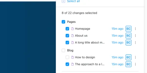
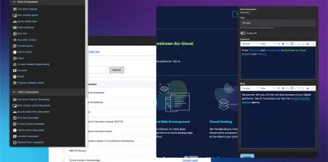
Experience Builder has pushed the boundaries of what Drupal can do. Here's how we can push it further.You've probably seen some excitement in the Drupal community around Experience Builder. The current version (0.5.0-alpha1) shows a giant leap forward in Drupal's page building and editing experience.Lee RowlandsSenior Developer
Navigating Drupal AIThe Drupal AI initiative is a hive of activity. There’s a lot to keep up with, so we’ve put together an overview of Drupal and AI, along with our position on these advancements, to help you cut through the noise.Kim PepperCo-Founder & Tech Director
Three features for creating a great website experienceOver the past few years of working on large-scale Drupal projects for government and higher education, I have noticed how successful these new platforms are when developers include three key features in shaping the tech stack.Ana BeltranAgile Delivery Manager
My journey to becoming a Core maintainerHow do you find your niche and become a Drupal Core maintainer?Daniel VezaDeveloper
Two Suppliers, One Team: A collaborative Catholic Schools NSW Drupal projectHow to run a successful, collaborative Drupal transformation project with two suppliers and one delivery goal.Griffyn HeelsAgile Delivery Manager
Building the experience builder experienceWith Experience Builder in development and set to change how editors work in Drupal, Lee provides an overview of this ambitious initiative.Lee RowlandsSenior Developer
Everything you need to know about Content Security Policy (CSP)Interested in learning how to build, implement and analyse a Content Security Policy? Michael shares some critical insights and lessons learned from a large government website built on Drupal.Michael StrelanSenior Developer
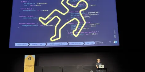
Avoiding CSS crime scenes - practical tips for maintainable stylesCSS is as easy to write as it is to mess up. Discover some common pitfalls of CSS and how to avoid them.Tina ReymannFront end Developer
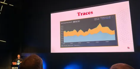
Video: Deep Telemetry with eBPF and RustNick talks about building an open-source telemetry system on top of eBPF, Rust, and Go for instrumenting the PHP applications that run on our hosting platform, Skpr.Nick SchuchOperations Lead