
Drupal front-end nirvana with Vite, Twig and Storybook
We're proud to announce the release of vite-plugin-twig-drupal, a plugin for Vite that we hope will improve your workflow for front-end development with Drupal.
The problem space
You're working with Twig in a styleguide-driven-development process. You're writing isolated components that consist of CSS, Twig and JavaScript. You want to be able to use Twig to render your components for Storybook. You want fast refresh with Vite. You want Twig embeds, includes and extends to work. You want to use Drupal-specific twig features like create_attributes etc. You want compilation of PostCSS and SASS to CSS. You want Hot Module Reloading (HMR) so that you can see how your components look without needing to endlessly refresh.
Enter vite-plugin-twig-drupal
The Vite plugin Twig Drupal is a Vite plugin based on Twig JS for compiling Twig-based components into a JavaScript function so that they can be used as components with Storybook. It allows you to import Twig files into your story as though they are JavaScript files.
Comparison to other solutions
- Vite plugin twig loader doesn't handle nested includes/embeds/extends. These are a fairly crucial feature of Twig when building a component library as they allow re-use and DRY principles
- Components library server requires you to have a running Drupal site. Whilst this ensures your Twig output is identical to that of Drupal (because Drupal is doing the rendering), it is a bit more involved to setup. If you're going to use single directory components or a similar Drupal module like UI patterns then this may be a better option for you.
Installation
This module is distributed via npm, which is bundled with node and should be installed as one of your project's devDependencies:
npm install --save-dev vite-plugin-twig-drupalYou then need to configure your vite.config.js.
import { defineConfig } from "vite"
import twig from 'vite-plugin-twig-drupal';
import { join } from "node:path"
export default defineConfig({
  plugins: [
    // Other vite plugins.
    twig({
      namespaces: {
        components: join(__dirname, "/path/to/your/components"),
        // Other namespaces as required.
      },
      // Optional if you are using React storybook renderer. The default is 'html' and works with storybook's html
      // renderer.
      // framework: 'react'
    }),
    // Other vite plugins.
  ],
})
With this config in place, you should be able to import Twig files into your story files.
Examples
To make use of a Twig file as a Storybook component, just import it. The result is a component you can pass to Storybook or use as a function for more complex stories.
// stories/Button.stories.js
// Button will be a Javascript function that accepts variables for the twig template.
import Button from './button.twig';
// Import stylesheets, this could be a sass or postcss file too.
import './path/to/button.css';
// You may also have JavaScript for the component.
import './path/to/some/javascript/button.js';
export default {
  title: 'Components/Button',
  tags: ['autodocs'],
  argTypes: {
    title: {
      control: { type: 'text' },
    },
    modifier: {
      control: { type: 'select' },
      options: ['primary', 'secondary', 'tertiary'],
    },
  },
  // Just pass along the imported variable.
  component: Button,
};
// Set default variables in the story.
export const Default = {
  args: { title: 'Click me' },
};
export const Primary = {
  args: { title: 'Click me', modifier: 'primary' },
};
// Advanced example.
export const ButtonStrip = {
  name: 'Button group',
  render: () => `
    ${Button({title: 'Button 1', modifier: 'primary'})}
    ${Button({title: 'Button 2', modifier: 'secondary'})}
  `
}
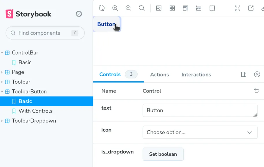
Here's how that might look in Storybook (example from the Admin UI Initiative storybook)
Dealing with Drupal.behaviors
In cases where the JavaScript you import into your story file uses a Drupal behavior, you'll likely need some additional code in your Storybook configuration to handle firing the behaviors. Here at PreviousNext, we prefer to use a loadOnReady wrapper, which works with and without Drupal. However, if you're just using Drupal.behaviors something like this in your Storybook config in main.js (or main.ts) will handle firing the behaviors.
const config = {
  // ... existing config
  previewBody: (body) => `
    <script>
    window.Drupal = window.Drupal || {behaviors: {}};
    window.drupalSettings = Object.assign(window.drupalSettings || {}, {
      // Mock any drupalSettings your behaviors need here.
    });
    // Mock Drupal's once library too.
    window.once = (_, selector) => document.querySelectorAll(selector);
    document.addEventListener('DOMContentLoaded', () => {
      Object.entries(window.Drupal.behaviors).forEach(([key, object]) => object.attach(document));
    })
  </script>
  ${body}
  `
  // ... more config
}
Give it a try
We're looking forward to using this plugin in client projects and are excited about the other possibilities Storybook provides us with, such as interaction and accessibility testing.
Thanks to early testers in the community, such as Ivan Berdinsky and Sean Blommaert, who've already submitted some issues to the github queue. We're really happy to see it in use in the Admin Initiative's work on a new toolbar.
Give it a try, and let us know what you think.
Keep the discussion going here
Github forum for the projectRelated Articles
The right way to check for empty content in Twig
Have you ever used {% if content|render|trim is not empty %} in twig to validate content is not empty? If so, you might end up with some surprises related to the use of the render method.

Theming with Bundle Classes, Layout Builder and Twig
VIDEO: Bundle classes and Layout Builder are powerful combinations. Discover how to use these with Twig to build and theme testable, clean, modern Drupal sites.
