When you have a full-time job or a family, finding time to study can be a real challenge. For many of its courses, Charles Darwin University (CDU) provides online learning options which affords students the flexibility to study however it suits them. PreviousNext was engaged to develop a comprehensive User Experience strategy and design to complement our Drupal CMS services for CDU with the goal to enhance how site visitors find information and sign up for courses.
Enabling students to study their way
Charles Darwin University is ranked among the top 2% of universities worldwide. This reputation along with the flexibility in their study options, meant that the design and functionality of the website had to meet the needs of both internal and external users. Working closely with CDU to bring the design and guiding principles of their website into alignment with their key objectives, the challenge was to help users find relevant and sign up for their preferred courses as easily as possible. We commenced our UX strategy by undertaking comprehensive user research - studying how users used the existing site and using one on one interviews to determine how it could be improved. This process highlighted a wide range of roadblocks users were encountering and provided some clear guidelines on how to solve them with the redesign.
Discovery: Key Insights
We uncovered a number of key takeaways from our user research:
- A significant number of prospective students wanted to study to attain an industry-accreditation in their field; they wanted to take the next step in their career.
- Another motivator among a large customer group was the desire to start a new career and life altogether - one which had real impact and meaning within their community. This behaviour was often reflected by parents whose children had recently started school.
- While both groups were driven by different goals, both were highly-motivated to study. Both user types valued flexibility around their current responsibilities (whether that was a full-time job or obligations as a parent).
- All users focused on career paths and study areas as opposed to searching for specific course names.
- Users enter the site primarily via search engines on lower level pages, so the navigation paradigm needed to function regardless of their entry point.
- The use of internal university terminology and acronyms was problematic for most users to easily understand.
- International students needed very specific information that wasn't relevant to Australian students.
- All users are spending weeks researching CDU courses in comparison to competing universities before applying for their preferred course.
These findings were tested in a working prototype with users and refined until all issues were clearly resolved.
Target Audience: Personas
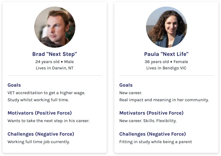
- Brad represented our "Next Step" customer group. They were driven by gaining an accreditation to advance in their career.
- Paula represented our "Next Life" customer group. What was driving them was the desire to make a big change in their lives - a new career which impacted not only their own lives, but their community as well.
These personas were used to recruit people for user testing and to validate any design approaches throughout the process.
How did Charles Darwin University stack up against the competition?
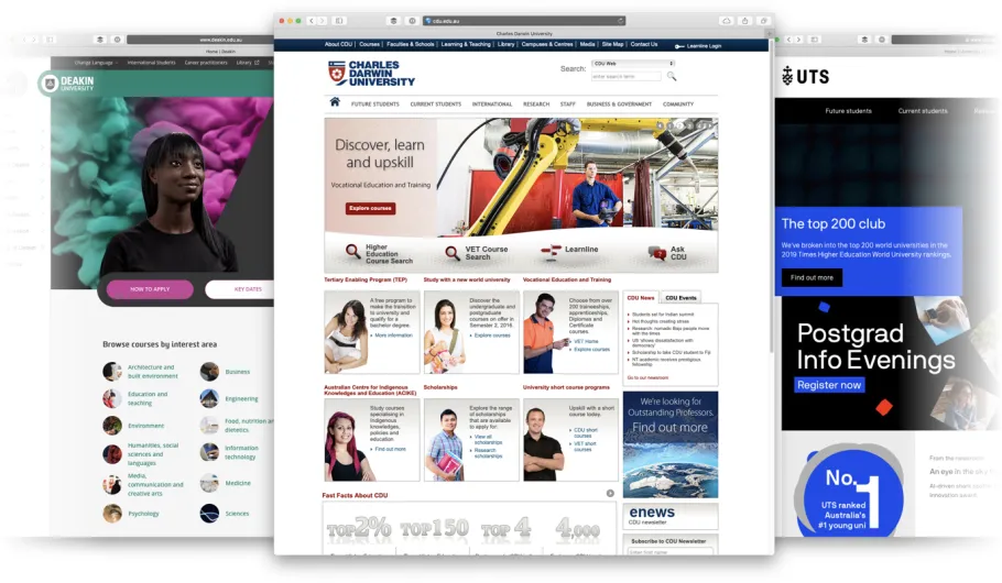
A comparative review gave us a better sense of the landscape and provided insight around how the existing website stacked up to the competition.
While the review process uncovered a lot, there were two areas in particular which required the most attention:
Design Consistency
The website wasn't consistent with their new branding. In fact, it wasn't consistent with any branding. Several sections and micro-sites were created at different times (often with different teams) leading to a fragmentation in the overall experience.
The relaunch was taken as an opportunity to not only give the website a much-needed refresh, but more importantly, to work towards establishing brand consistency throughout the digital channels.
Not intuitive
Discoverability was a fundamental user experience issue with the old site. With so much content trying to fit "above-the-fold" and not enough structure or hierarchy to guide the experience, it was difficult to know where to start.
This led to missed opportunities for visitors who actually wanted to interact with the website. Having a design that was built around user intent was what we advocated for in our design approach.
Design Approach: Who we optimised for
A validating insight from user research was that we had interested, prospective students that were motivated to study. The main challenge to overcome was the poor experience they had to navigate through.
To summarise, the challenge was that they weren't able to find the right content. Finding information that was relevant to their area of study or their personal circumstances (such as accommodation options) wasn't as accessible as it should've been. Fortunately, most of the content was there, it just wasn't structured in a findable way.
With this in mind it was clear that we had to optimise the "Find a Course" user flow and how the primary personas would experience it. This meant that not only did we have to make the courses easier to find, we also had to consider how we made related content more readily-available and contextual.
Designing for Intent
Reducing Steps
Previously, finding a course required users to access a separate website (the CDU Course Finder). As this website looked completely different to the main website, this step made for a disjointed user experience.
On top of that, the courses weren't grouped by study areas. Allof the courses were grouped alphabetically which meant you had a Bachelor of Accounting right next to a Bachelor of Arts — it was confusing.
Providing Clear Choices
Too much content (with not enough hierarchy) made for difficult decision-making — it wasn't a guided experience. Beyond reducing steps in the process, we had to make the key touch-points work harder by making choices clearer and easier to make.
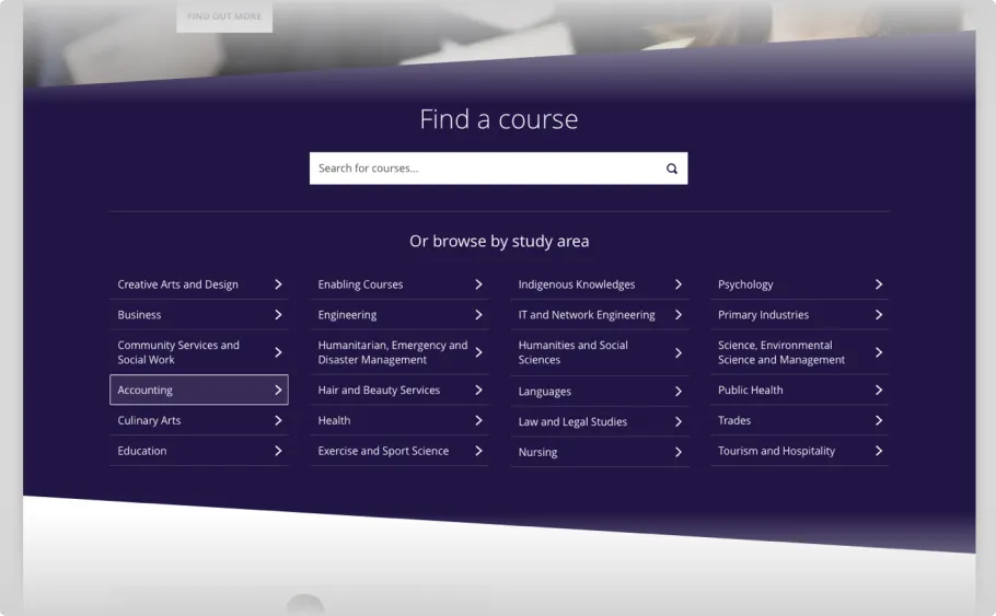
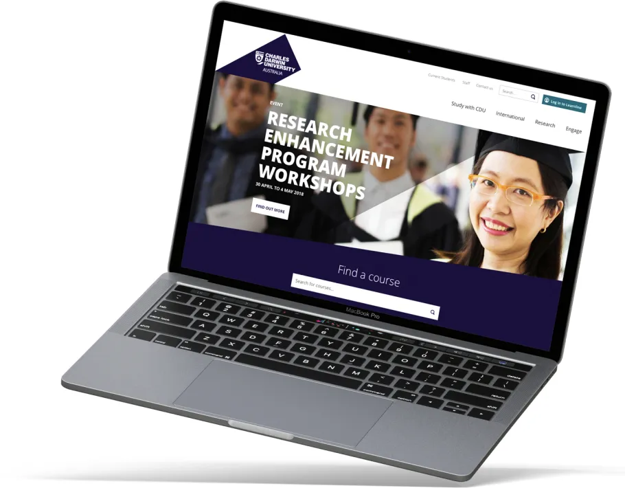
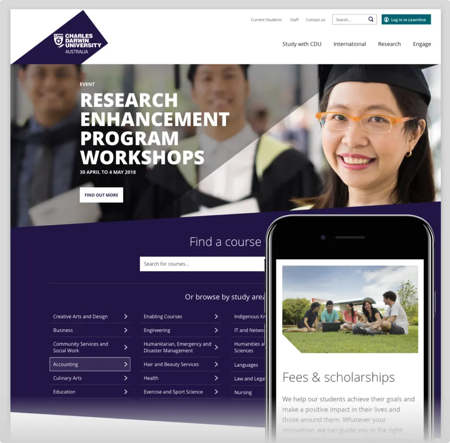
Course Search
A custom course search component (which featured on the homepage and study-area landing pages) gave users a clear place to start. A prominent search field made it easy to start looking for a specific course, and the listed out areas of study provided a starting point for people who were actively browsing areas of interest.
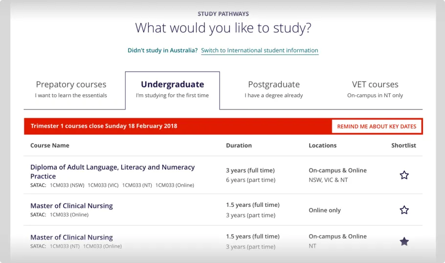
Course Listing
Dividing courses by degree type (on course listing pages) also made it easier to find courses that were actually relevant. Providing tabs to filter courses by sections like undergraduate and postgraduate made for a much more intentional browsing experience.
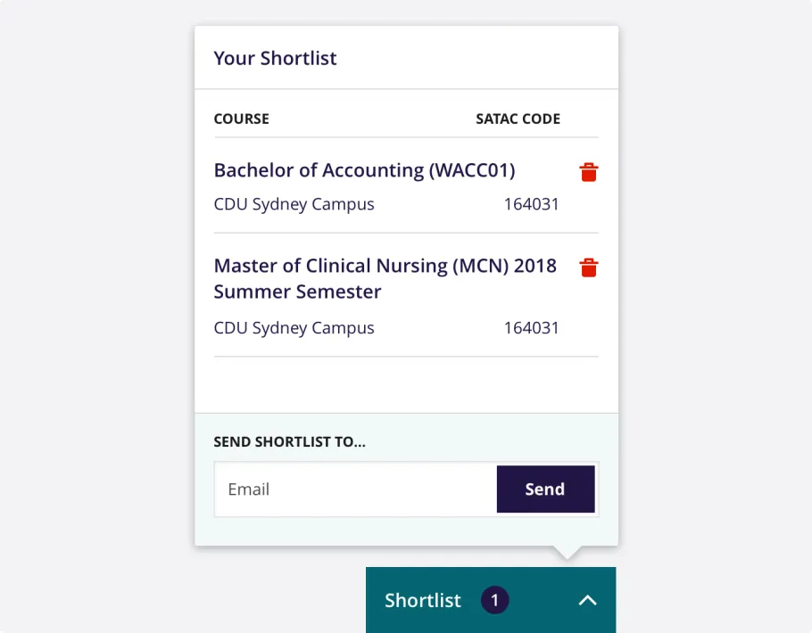
Shortlist
While we'd narrowed our focus to the primary personas and a core user flow, there was one aspect of the solution that felt underserved - the prospect's mindset.
For students that were ready to act now, we were making it easier and faster for them to get the content they need.
But for students that were passively researching, we needed a way to afford them the ability to save courses for later (whether it was for themselves, or to send to their own support group). This was where the shortlist came from.
Courses could be added to a shortlist which enabled users to not only save them for later, but to give them the ability to send the list onto others.
Summary
What we found most interesting throughout the course of the project was that the problem wasn't so much about promoting the benefits of the university. Instead, it was about streamlining the experience students had when researching courses. In most cases, prospective students already wanted to study at Charles Darwin University, so our guiding principles were around enabling students to start their new life and make a difference with a new world university.
The results of the CDU redesign have been significantly positive, providing website administrators with much more flexibility to customise course content pages and ensuring that prospective students have much easier paths to review courses and sign up.
Visit Charles Darwin University