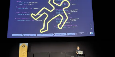
Avoiding CSS crime scenes - practical tips for maintainable styles
CSS is as easy to write as it is to mess up. Discover some common pitfalls of CSS and how to avoid them.

Accessibility goes beyond compliance: it’s not about robots reading your site, but about people being able to use it with ease.
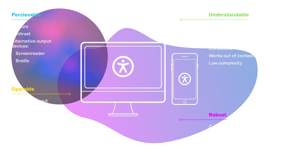
For many developers, the Web Content Accessibility Guidelines (WCAG) are second nature. But ticking all the boxes still doesn’t automatically mean a great user experience. The way we think about accessibility has shifted from “make sure machines can read it” to “make sure people can understand it”.
Surveys show most people using assistive technology feel their experience could be improved a lot by better websites, but won’t report problems they encounter. Your site could be compliant but still pose challenges to your users without you knowing.
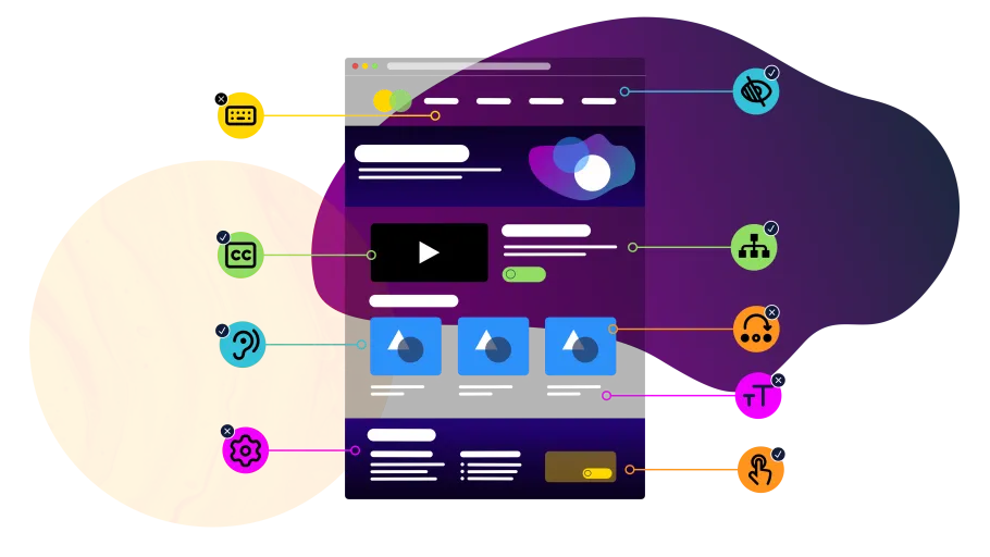
Accessibility is about reducing friction for many kinds of users, each with their own tools, habits, and challenges. Some have permanent disabilities, others temporary injuries, neurodivergence or other needs that can make interacting with a website challenging:
Sometimes the needs of different groups can almost contradict each other; e.g. blind users often want concise, skimmable pages, while low-vision users may prefer fuller descriptions to make sense of elements they perceive but can’t see properly.
As developers, it’s easy to fall into shorthand thinking like lumping “keyboard and screenreader” together and assuming things like a screenreader-only skip link works for everyone. But accessibility isn’t a single combination of tools. Not all keyboard users rely on screenreaders, and not all screenreader users navigate primarily by keyboard. Many people browse with mobile screenreaders like VoiceOver (iOS) or TalkBack (Android). Others use braille displays, switch devices, or eye-tracking systems — each creating a different experience.
To design accessibly, we need to think beyond a single setup and account for the diverse ways people actually interact with the web.

Guidelines like WCAG are invaluable to simplify that process, but they don’t guarantee a good user experience. In some contexts, they even create friction: we’ve come across several cases where users found them unhelpful or actually hindering.
This doesn’t make the guidelines wrong — it just means we need to also think about how real people actually use the web.
People interact with the web in many different ways, using a mix of assistive technology, devices, and personal strategies. Navigation styles, preferences, and experience levels can vary widely, as does the way assistive technology interprets and presents content.
The best way to get an idea of that is through real user testing (e.g. through seemeplease.com). Watching people try to accomplish common tasks, or exploring complex tables, widgets, or menus, provides insights beyond the checklists. Just keep in mind that one person’s experience may not represent everyone’s.
In the end, it’s nearly impossible to design perfectly for every need. But aside from just following the WCAG, we can focus on patterns and practices that help multiple groups, keep in mind where groups might differ, and spend more time testing the complex and/or fundamental parts of our sites — like menus, forms, or data tables.
If this feels like a lot of work, remember that many things originally designed for accessibility now benefit everyone. The typewriter was invented for a blind countess who couldn’t write letters by hand. Curb cuts (sidewalk “ramps”) were created for wheelchairs, and audiobooks for vision-impaired readers. That’s just to name a few. Accessibility solutions often become universal improvements.
Surveys and user testing highlight common pain points – not all of which are automatically covered by WCAG compliance:
At the same time, people consistently point to practices that make the web easier to use:

Accessibility isn’t about ticking boxes — it’s about reducing friction for real people. WCAG gives us a vital foundation, but it’s not the finish line. The real test is listening to users as they complete real tasks and questioning our own assumptions.
That means:

CSS is as easy to write as it is to mess up. Discover some common pitfalls of CSS and how to avoid them.
Automated accessibility tools are only one part of ensuring a website is accessible, but it is a very simple part that can catch a lot of really easy to fix issues. Issues that when found and corrected early in the development cycle, can go a long way to ensuring they don’t get compounded into much larger issues down the track.

Keyword search can miss the mark. So instead, we turned to semantic and hybrid search, built with Drupal, OpenSearch and Skpr. The results were impressive.